If you are familiar with my recent Meteor Shower, you know I am no stranger to inky situations gone awry. Well, stick around, we're about to get a repeat.
Acrylic Block Stamping:
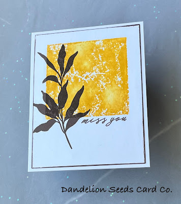
For this first card, I used a technique I had tried a few years ago when I first got back into card making and didn't have many supplies. Honestly, I didn't like it. At all. However, the instructor for this class had used it successfully, so I tried to trust the process and persevere through my skepticism.
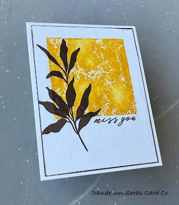
I used a 3 x 3" acrylic block I've had in my stash for years, and inked it up by pouncing on Concord & 9th Buttercup ink. I spritzed it with my Tim Holtz Distress Sprayer a couple times, and then stamped it down onto a panel of 110# card stock. I held it for maybe 30-60 seconds, which is probably longer than necessary, but I wanted to be sure the ink transferred. Remember, I had already failed at this once.
I didn't get good coverage, and the Buttercup ink didn't seem dark enough. So, I pulled out my Fossilized Amber Distress Ink and inked up the same block, spritzed it, and tried to line up the block directly on top of the previous stamping.
I held it in place quite a while again, and this time when I removed the block, the coverage was a little better. Not great, but better. You know what they say: Comparison is the thief of joy. Well, my stamping looked nothing like the instructor's stamping. Joy sucker.
I wanted to add a little more definition to the edges of the square, but was also worried my card stock was getting oversaturated. I chose the risk, inked up only the edges with the Fossilized Amber and stamped again. Good enough.
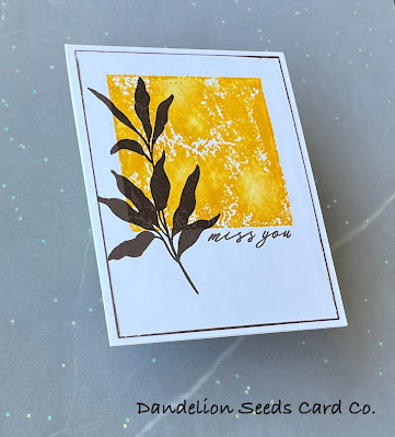
After drying the panel, I stamped a tall branch from the Altenew Leaf Cluster set, using Gina K Charcoal Brown. I stamped again to darken it, but then switched to Gina K Dark Chocolate to get a darker image. Using the Dark Chocolate, I stamped a sentiment from the Altenew Garden Silhouette stamp set.
Instead of matting the panel, I tried out another technique from this class: edging the paper with a direct to paper inking. I trimmed the panel to 4 x 5.25" and used the Dark Chocolate to ink the edges. Since the acrylic block stamping had been a little rough and grungy-looking, I went a little messy for the inking on the edge.
I added the panel to a white A2 card base, and that was that.
Maybe the acrylic block inking is "better" than the first time I tried it 2-3 years ago, or maybe not. Maybe the inking is the same and I am different. But I actually like the finished product. This could be another one of those Clean and Simple Boutique cards that are really becoming my style.
Brayering on Ink:
I am no stranger to a brayer. I own a gel plate, so I own a brayer. You'll notice I didn't say I use a gel plate and brayer. I do, however, occasionally brayer on ink in embossing folders, so I do have experience with the process. That meant nothing here.
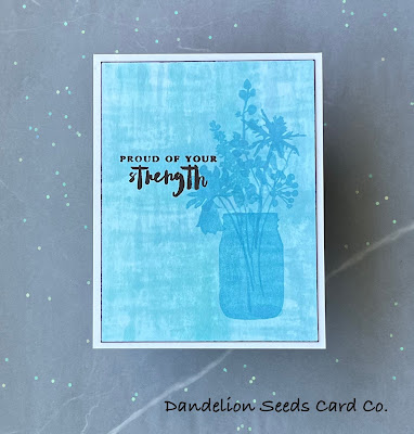
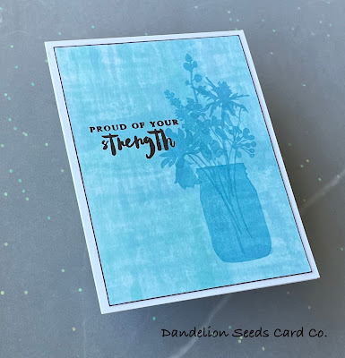
The technique for this card is to smoosh ink onto a mat, spritz with water, and then brayer on to plain card stock. Easy enough, right? Uh, no.
I began with Concord & 9th Aqua Sky ink and my Tim Holtz brayer because that's the newest brayer I own, the good brayer. I smooshed the ink onto my glass mat, spritzed a couple times, and ran the brayer through the puddle. Back and forth. Back and forth. The ink simply beaded up on the brayer. I could not get good coverage, and the class instructor had stressed the importance of that.
A few more squeak, squeak, squeaks of the brayer, and then I just went with it. I rolled the brayer across my card stock and I got one little streak of blue. Remember that joy sucker, Comparison? Yeah, this was not what brayering ink should look like.
I tried again with the same ink and brayer, and basically got the same results. Again. Again. I switched to my old red rubber brayer, the bad one, and tried again. Same. I switched to my Waffle Flower stencil mat, so I was smooshing and brayering on a less slick surface. Same. I switched to Concord & 9th Harbor ink, thinking my Aqua Sky pad might be contaminated and, therefore, making the ink bead up. Same.
Obviously, if you add enough single streaks of ink to your paper, it will begin to fill in the background, and that's what I did.
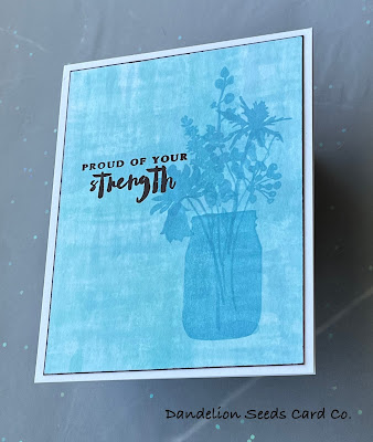
Remember Comparison? My background looked nothing like the instructor's background, and I had a couple blobby water spots that were not ideal. It wasn't horrible, though, so I dried the panel and moved on to the focal image. Using Concord & 9th Harbor ink, I stamped the solid jar image from the Altenew Garden Silhouette set. I strategically placed it to cover the water blobs, which we are now calling shadows created by the jar.
I chose a variety of short and taller flower images from the Garden Silhouette set and added them to the jar. I tried to not have them overlap too much, but a little overlapping didn't seem to look unnatural.
For the greeting, I stamped a sentiment from the Altenew Bamboo Rose set in Charcoal Brown. I trimmed down the panel to 4 x 5.25" and inked direct to paper around the edges to add definition. Finally, I added the panel to an A2 white card base.
And here we have yet another Clean and Simple Boutique card.
The Lesson Here?
Both of the techniques for these cards are things I had tried before, so it's not as if I went into this completely green. Nonetheless, I struggled. Maybe this struggle was completely fabricated by my insecurity. Maybe not. But just as I had learned to do with my meteor shower, I persevered, I trusted the process, and in the end, I triumphed. You can, too. I believe in you.
Thanks for stopping by!
Tammy

I love how you explained each technique and how each turned out. They are both great cards, Tammy!
ReplyDeleteThank you so much! I appreciate your positive feedback!
DeleteElegant and beautiful! Your projects look amazing!!
ReplyDeleteThank you so much!
ReplyDelete