Hello! And welcome to my next card share in my Altenew Educator Certification Program!
I am especially excited about the simplicity of these cards. If there is one thing I am learning about myself during this AECP adventure, it's that I most appreciate clean and simple, polished and professional, and basic but stunning designs. I think today's cards fit the bill.
With these two cards, I have uniquely used ink blending -- one where the ink blending is a soft backdrop behind a bold focal image, and the other where the blending is the wow factor. Both are equally beautiful.
Let's dive right in, shall we?
The Soft Background:
The design for this card is so simple, so basic, and yet it's something I never think to do on my own. Why is that? Why do we always think a design has to be fussy and over the top to be visually appealing? That's a rhetorical question, by the way.
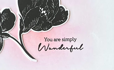
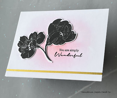
For this card, I blended Altenew Blush ink in a circular motion, using a light hand, but focusing the heaviest ink in the center of an A2 panel and blending out to nothingness. I thought the ink might not be noticeable enough, so I added Altenew Rouge ink, just in the center of the Blush. For a focal image, I stamped a flower cluster from the Altenew Pen Sketched Silhouette set in Versafine Onyx Black ink, die cut it, and adhered it off-center. I used that same black ink to add a sentiment from the same set. Into the Washi Graveyard!
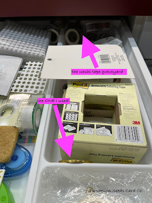
In the back of my adhesive drawer lies a heap of unused washi tape -- some of it older than my children. What inspired me to dig it out? Well, in my last class, All About Layering 4, the instructor used gold washi tape as an accent on her cards, and it looked pretty remarkable, not cheap and kindergarten art project-ish at all.
I decided this clean and simple card could use just a little bit of shine, so I dug out an 1/8" wide roll of gold washi and put one stripe across the card, about 1/2" from the bottom. It's really somewhat of a miracle that it was still sticky after all these years! I burnished it well, just in case! Just that one stripe, and I've decided I might just resurrect the washi graveyard.
I think this card could fit well into the Clean and Simple Boutique Cards class I completed a few weeks ago. It definitely radiates class.
Emboss Resist:
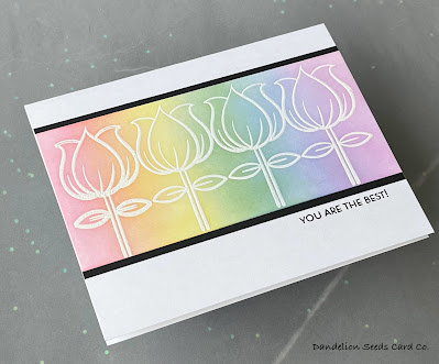
It's kind of ridiculous how much joy this tiny tulip brings me. I don't know why; it just makes me happy. I've had my eye on it ever since it was a brand new stamp that Altenew offered as a free-with-order product. I could just never justify paying shipping expenses in excess of the product price, so I did without. Until my most recent order, that is!
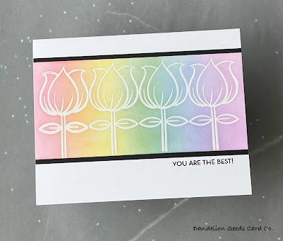
For this card, I stamped the Whimsical Tulip repeatedly across a card panel, using Versamark ink. (Don't forget to dust with an anti-static powder tool first!) I sprinkled on Hero Arts Fine Detail White Embossing Powder and then heat set with my seriously ancient Marvy-Uchida heat tool.
Tangent Warning...Is anyone else still holding tight to their gold glittery and maroon heat tool? I mean, it still works, right!
Starting from the left, and using a very light hand, I inked blended a rainbow of Gina K inks in Light Carnation, Lemon Drop, Powder Blue, and Lovely Lavender, being sure to overlap the colors and go back over each color at least once, until the blend was smooth.
I trimmed down the panel to 2.5 x 5.25" -- because this just happened to be the size that made the tulips look centered -- and matted it onto a black panel cut to 2.75 x 5.25". I adhered this just above center of a landscape-orientation card base, cut slightly narrower than A2 size. I stamped a sentiment from the Altenew Leaf Canopy set, using Versafine Onyx Black. Embellishments? You Ask:
In the end, I chose not to add embellishments, but it wasn't an easy decision. Have I mentioned how indecisive I can be?
Here's the funny thing about how my visual brain works. When I'm trying to decide on embellishments, I have to lay them out in multiple configurations and take pictures of each option with my phone. Then, I swipe back and forth between the options until I decide which looks best. Crazy, right? But there seems to be something my brain needs, something about blocking out everything else on my work surface, so I can focus on only the card and embellishments.
Squirrel!
Maybe this card would have been better with a touch of shine or sparkle, but my foolproof method of embellishment decision-making failed me, so I gave up and left them off. Right or wrong, it's done.
The Lesson Here?
Ink blending is a useful technique to keep in your crafty toolbox. It is versatile enough to be a backdrop or a focal point. Whether soft, as I have used it on these cards, or bold, as I will share in an upcoming post, it can be gorgeous and attention-getting.
Maybe ink blending is the thing you've forgotten you knew how to do, or maybe it's some other basic technique you forgot was in your wheelhouse. Whatever it is, the next time you remember what you forgot, use it before you forget it again.
Thanks for stopping by!
Tammy



Super duper classy!!
ReplyDelete