It's Monday! And that means I'm sharing another color matching inspiration!
To be honest, I was a little nervous about this one. I do like green and purple together, as in olive and dusty purple, which this color story is certainly not. But, if the colors show up in fashion, someone must be willing to wear them, so they can't be that bad. Lime + Lavender it is.

Today's colors were inspired by this photo by @nocturne via @notjustalabel and shared by @colorstoriesbystacia on Instagram. This is where I've been getting all my color inspiration at the moment although I'm hoping to get outside my craft room at some point and find my own real life inspiration somewhere.
The Challenge:
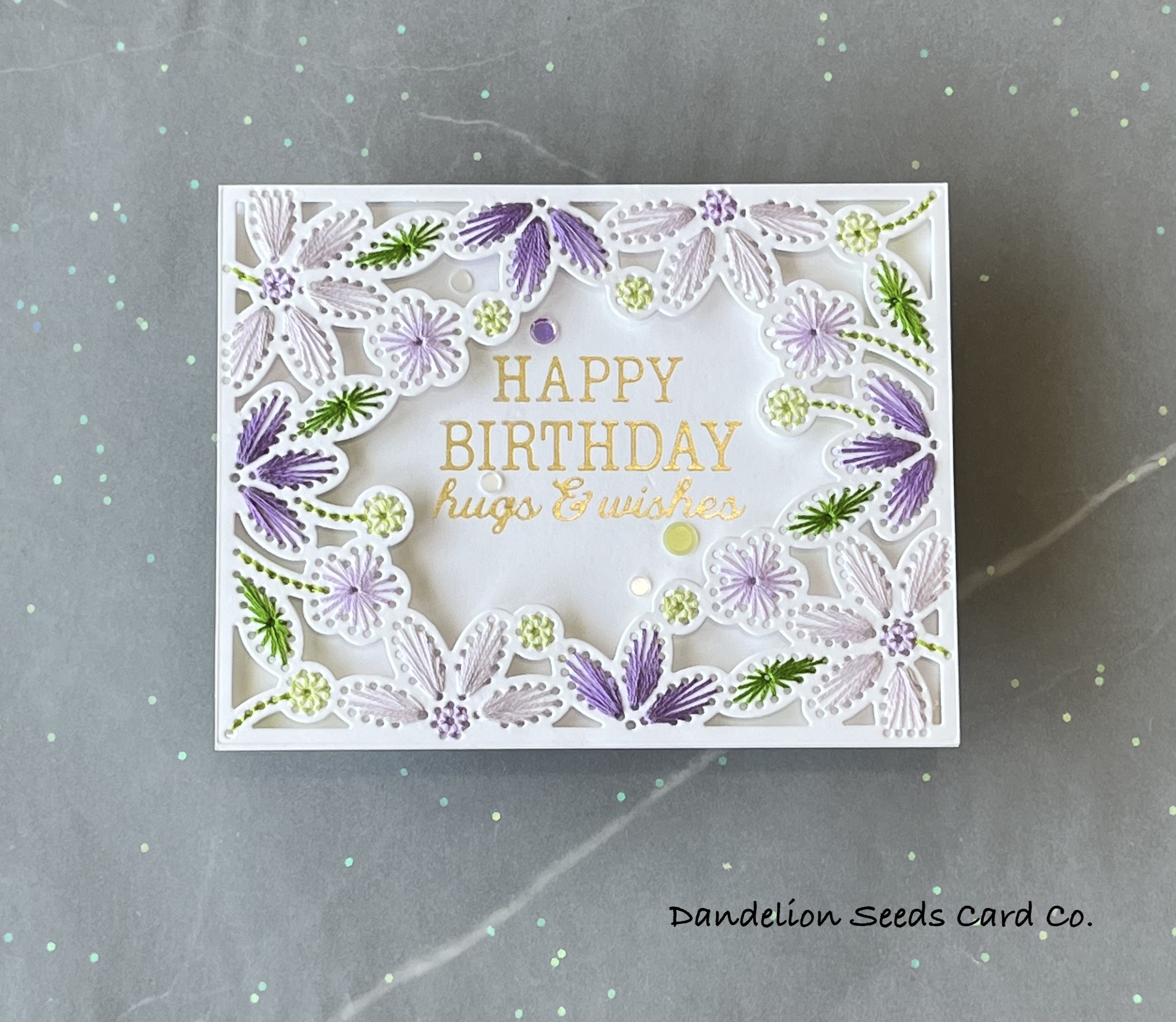
I decided to use the Spellbinders Stitched Card Front on white this time, which presented the challenge of incorporating all the colors into the design with thread! To accomplish this, I simply picked a single element to stitch in each of the seven colors, and that just happened to work out!

Here's the breakdown:
- DMC209: medium-sized, three-petal flowers
- DMC210: centers of the four largest flowers
- DMC211: four smallest flowers
- DMC25: four largest flowers
- DMC15: puff balls
- DMC907: stems for all the flowers & puff balls
- DMC906: leaves
I have to admit, as my DMC floss stash grows (exponentially), it is getting easier to find a close match for most of the colors in these inspiration photos. At the moment, I own 300 of the 500 DMC colors.
Need. All. The. Things.
Adding the Sentiment:
My favorite thing about this particular stitching die is that it's fairly idiot proof. Once the stitching is done, placing the sentiment is obvious; it goes in one place, and you just can't mess that up.

Using Glimmer Matte Gold foil, I foiled the Spellbinders Birthday Hugs & Wishes sentiment onto the card base, right where the design's empty spot will be. Because precise placement on this design is crucial, I used Glad Press'n Seal to hold the plates and foil in place on the paper. This does leave a little bit of adhesive residue on the paper, but it can easily be buffed off with a dry cloth after foiling.
Putting It All Together:
As I recently discovered, securing the thread ends with clear tape while I'm stitching is a game changer. It considerably reduces the bulk caused by knotting and gluing thread ends.

With this see-through, open design, I thought it would be cool to pop it up on the card base, so I painstakingly added an insane amount of foam tape and squares to the back of the panel. After removing the release tape, I put a dab of glue on all the foam, so the panel would have a little wiggle room, giving me time to get it into place.
I was right, the stitched design really pops when it's elevated above the card base!
I added a few sequins from the Pretty Pink Posh Wisteria Blossoms Confetti Mix, and that was it!

Such a pretty, pretty card! And while I would not wear these colors in clothing, as a card, they are quite lovely!

I hope this inspires you to make a bold move with your card making. Maybe that's an unexpected color combo, or a technique that you find rather intimidating, like alcohol inks or watercoloring. Really, you've got nothing to lose, and the results might just surprise you.
Thanks for stopping by!
Tammy
Tammy
Comments
Post a Comment